Data Science Meets Wordle
3/29/2022 • Rohan Mehta | Data Science, Wolfram Language
The word-game Wordle has gone viral in these first few months of 2022, and the trend doesn't appear to be stopping any time soon. In fact, the New York Times, which purchased the rights to the game just last month, has over five years worth of future words stored in the site (yes, I checked).
For those of us math and science types, though, Wordle has presented a second challenge. How do we divine the optimal way to play the game? Answering this question requires venturing into a field of math known as information theory, and 3B1B has, as usual, created a wonderful video on the subject.
It was watching this video, actually, that inspired me to do a different type of analysis of the game. I wanted to know: just how viral had it gone? How much were people playing, and where were the best players coming from?
Short of tracking all users, this task might seem impossible. Except for the fact that the Wordle trend has so deeply pervaded American culture that people have not only taken to playing the game on a daily basis, but also posting their scores on Twitter with similar frequency. Of course, the scores on Twitter aren't necessarily a representative sample of people's playing behavior at large, but we can still gain some interesting insights from them.
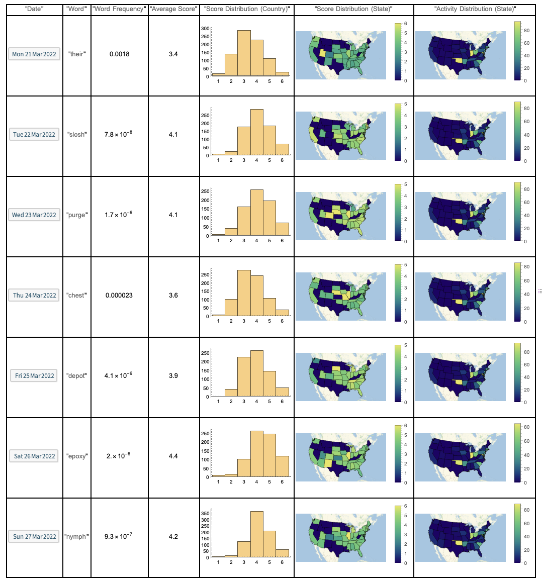
Using the Wolfram Language, I wrote a simple script to scrape Twitter for "#Wordle" Tweets from each of the fifty states. The program runs at around 9:00 PM every night, so that people have had ample time to post their score for the day, and tries to pull a hundred Tweets from each state. It then compiles this information to compute various statistics. The stats for last week have been assembled in the table shown below.
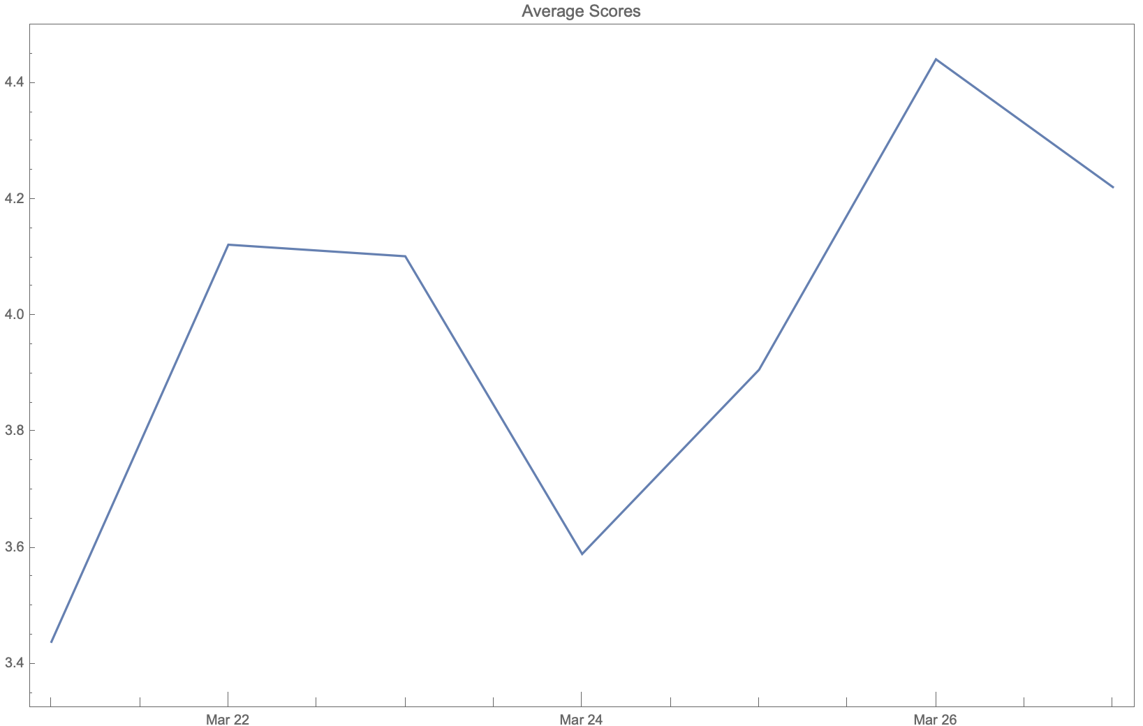
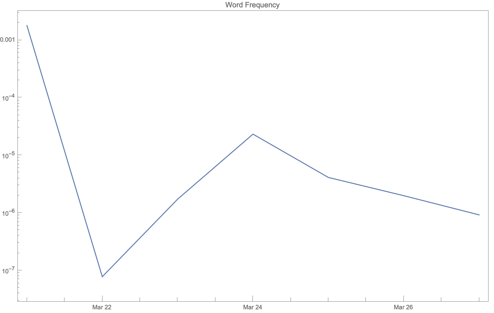
We can also see how the average score for the whole country and the word frequency of the chosen word varied throughout the week.
And even how the average score (on the left/top) and amount of Tweets posted (on the right/bottom) changed on a state-by-state basis.
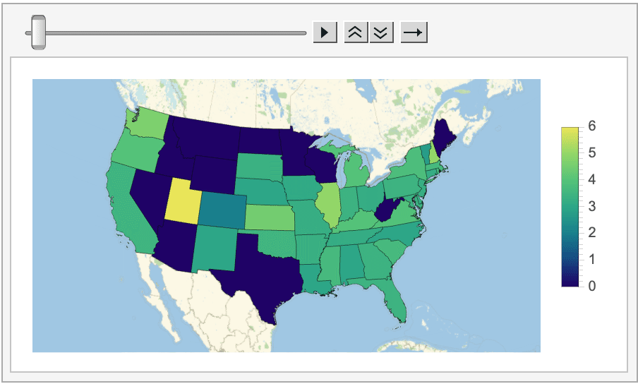
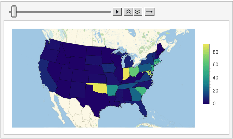
Looking at all of this data does reveal some interesting information. For instance, in most states (especially on the West coast and in the Midwest) posting Wordle scores on Twitter is essentially a thing of the past, as the program could never find more than a handful of tagged Tweets posted from these locations.
Oklahoma, on the other hand, consistently had the most Wordle-related Tweets this week (more than 90 every day!). My best guess is that this activity is coming from a specific cluster of Wordle-obsessed users, unless anyone else has thoughts on why Oklahoma is shaping up to be the Wordle capital of the US?
Moreover, even though the average score for the whole country always came out to be around four, there are noticeable variations depending on the difficulty of the word. For instance, the score for this week's easiest word, their, was a whole point lower than it was for the word epoxy, which is much more esoteric. Looking at the histograms is even more revealing, as arguably the two hardest words of the week, epoxy and nymph, had extremely left-skewed distributions, with almost nobody posting scores of one or two.
That said, the data-collection process has only just begun. It will be interesting to see what trends persist and which new ones develop in the coming months. To that end, I've created the Wordle Data Repository to host all the data that the program continues to collect. Be sure to check it out, and let me know what you discover!